Our new look


0 comments
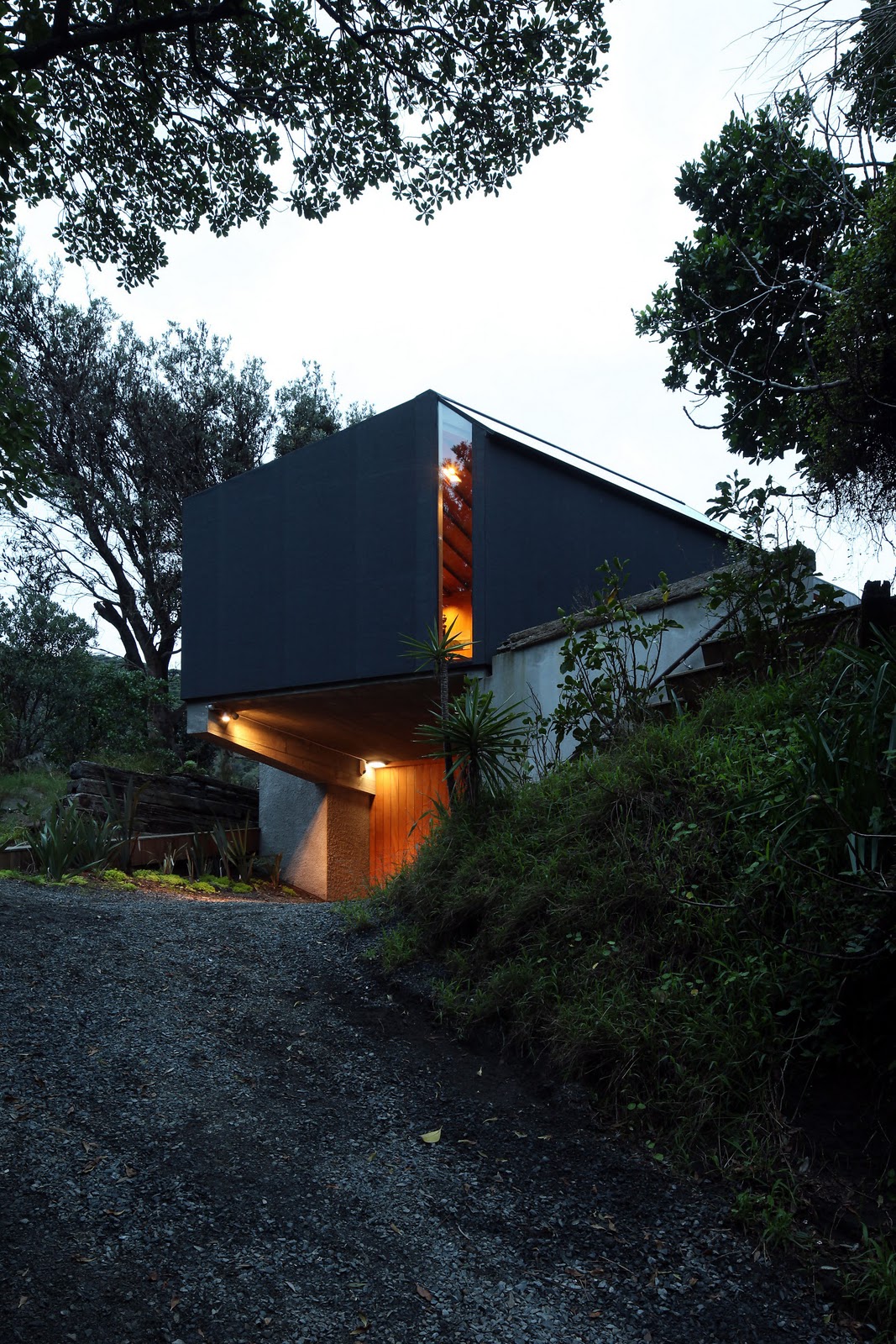
Those of you who haven't picked up our latest issue yet may not know that we've undergone a bit of a redesign, courtesy of the lovely team at Inhouse Design. We've put some of the opening spreads from the features in this issue below as a tease. The first is a story about the artist Andrew Barber, with photography taken at his Auckland studio by Jeremy Toth.


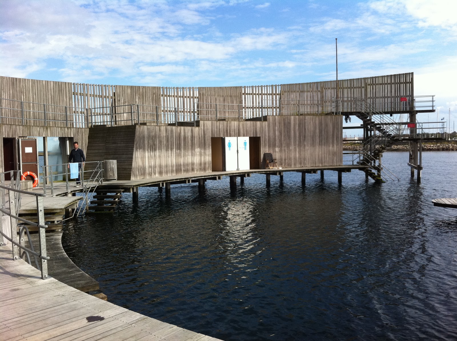
On the western shores of Lake Taupo is this bach, a former dental clinic sensitively adapted by architects Rick Pearson and Briar Green, and photographed by Simon Wilson.


Some people have been asking, what's the difference? Good point, as we have opened stories with two full-page images many times in the past. The difference on these pages is our new fonts, but in the body of the magazine we also have a new five-column grid (the underlying organisational structure for the layout), as well as different treatments of small devices like bylines and picture captions. Not enormous changes, and the intention was for it to be evolutionary, rather than revolutionary - so if you haven't noticed, that's OK!

Brian MacKay-Lyons: Tickets on sale now!


0 comments
The international member of our Home of the Year jury, Canadian architect Brian MacKay-Lyons, will visit New Zealand in February to help choose the winner of the Home of the Year award (the award results will be published in our April/May 2012 issue).

He'll be giving talks in Auckland (on February 8) and Wellington (on February 9) when he's here, and tickets are now on sale at the link here. Brian is a leading proponent of regionalist architecture, as well as being a sheep farmer and sea kayaker, so his talks promise to be fascinating (Architects get 10 CPD points for attending.) Thanks to our Home of the Year partner Altherm Window Systems for making Brian's visit possible.

That's Brian below, and a shot of one of his buildings by Greg Richardson. For more information about Brian and his work, you can visit his website here.


Our new cover


0 comments
Our new cover features an outdoor room on Great Barrier Island, designed by Lance and Nicola Herbst of Herbst Architects and photographed by Jackie Meiring. We really like it and hope you do too - subscribers should receive their copies today, and the magazine will be on newsstands on Monday December 5.


Our new issue also features a slick black cottage by Fearon Hay Architects on Great Barrier Island, a colourful, 50s-inspired bach on the Kapiti Coast by Parsonson Architects, New Zealand-born architect David Howell's glamorous New York apartment, a former dental clinic reinvented as a bach at Lake Taupo by Rick Pearson and Briar Green, and lots more. The graphic design boffins among you will also be interested to know that this issue features a redesign led by Arch MacDonnell at Inhouse Design. Let us know your thoughts on it...

From our archives: A hint of summer


1 comments
Summer's on the way. This cover from our June 1958 issue shows Tibor Donner's magnificent Parnell Baths in Auckland in all their splendour soon after they won the NZ Institute of Architects Gold Medal. The nice thing is they look just as good today.

We like: Hometown Boomtown


0 comments
Preservation arguments are raging in Christchurch right now, which makes this very interesting clip from the documentary Hometown Boomtown from NZ On Screen all the more pertinent. It examines the major changes to Wellington's cityscape (many of them made in the name of earthquake strengthening) in the 1970s and 1980s, includes interviews with many of the major players of the time (including Bob Jones and then-mayor Sir Michael Fowler), and has heaps of amazing demolition footage. Worth a look!


We like: Diana Vreeland, The Eye Has to Travel


0 comments
Sometimes those late-night internet shopping binges don't carry any post-purchase regret: this morning our copy of Diana Vreeland: The Eye Has to Travel arrived in the post, and we've all been swooning ever since. Vreeland was fashion editor at Harper's Bazaar in its mid-century heyday (with editor Carmel Snow and art director Alexey Brodovitch, with an incredible roster of contributors including Richard Avedon and a host of other top-notch photographers) before moving to become editor in chief at Vogue. The layouts she worked on are still beautiful and inspirational. (The image on the cover was photographed at Frank Lloyd Wright's Taliesin West). The book is a perfect Christmas gift.  


Outtakes: Melling Morse's Garden Shed


2 comments
Wellington's Melling Morse Architects do an accomplished line in compact, relatively cheap, incredibly charming dwellings, and the Garden Shed, a finalist in our 2011 Home of the Year award, is no exception. It was given its name because its site is a garden sub-divided from a larger property, and because the home's owner wanted to feel as if she lived in the garden (rather than in a house that had monstered it).

This desire to keep as much of the property for gardening as possible partly explains the decision to position the house right up against the footpath of its street. (These photographs are by Paul McCredie).


While it presents a relatively closed face to the street, the 65-square-metre home's northerly elevation opens to the garden, with tall windows drawing sunlight into the double-height kitchen, dining and living space. The generous scale of the home's terrace adds an interesting note of grandeur to an otherwise highly efficient composition.


The home's main bedroom is downstairs and opens onto the terrace that overlooks the garden. Upstairs (shown in the image below) is a space containing a mezzanine study area and room for a spare bed if needed (the owner currently uses this area for doing yoga).  

We like: Patti Smith's photographs


0 comments
There probably isn't anything this woman can't do. In the New York Times' style magazine, T, A.O. Scott interviews Patti Smith, who has an exhibition opening of her photographs, all of them beautifully composed and acutely observed. The link to the article is here, and the photograph of Smith below is by Anton Corbijn from the New York Times.

From our archives: A royal visit, 1953


0 comments
In 1953, the visit of the Queen and Prince Philip was considered significant enough to make the cover of our predecessor, Home and Building.

Events: The Department Store


0 comments
Thanks to Altherm Window Systems, Waipara Hills wines and The Department Store for their support for a client function we held at The Department Store in Takapuna last night.

Our guests got to use their Department Store vouchers from their gift bags (which also contained The Department Store newspaper and a copy of the new issue of HOME) to shop a little before our conversation about design with architects Patrick Clifford of Architectus, Michael O'Sullivan of Bull O'Sullivan Architects and Richard Naish of RTA Studio.

We even had a celebrity guest (thanks for coming, Tim Finn!).


We like: Al Brown's Depot


0 comments
We would like to join the chorus of approval for Al Brown's Depot in Auckland's Federal Street. The pleasingly rustic interior, designed by Charlie Nott, feels as if it has always been there; the food is easy-going and excellent, and the service impeccable. These photographs are by Florence Noble, and are also featured (along with a terrific write-up by Simon Farrell-Green) in our latest issue. We wish the eatery was a bit closer to work, as we'd go there even more often.

Below, Al Brown at Depot before the lunchtime rush (the place is open from 7am but doesn't take bookings, so it's best to arrive earlyish to ensure you get a table in good time, although the staff are very good at managing waiting times).


A vintage aesthetic permeates the place, making it feel like a long-lasting and well-loved establishment, even though it's pretty new. Just out of shot in this pic is where they shuck the excellent oysters.


Diners down the back get a good view from their benches of the small kitchen.


Events: Kevin McCloud, a reminder


0 comments
A reminder, for those of you who don't have your tickets yet (and many of you do, we know), that HOME New Zealand is delighted to be part of the team bringing Grand Designs host Kevin McCloud to New Zealand to do a lecture at The Civic in Auckland on Wednesday October 26, 2011. Tickets are on sale via The Edge at the link here.


We like: David Hockney's iPad show


0 comments
One of the best things about our recent visit to Copenhagen was seeing David Hockney's show of his drawings on the iPad and iPhone at the Lousiana Museum of Modern Art (which is about 30 minutes by train north of the Danish capital). In a darkened room, a wall was lined with iPads showing slideshows of Hockney's sketches - all of them small observational moments with an incredibly charming naive quality to them.

Hockney began using the 'Brushes' application on his iPhone in 2008 and drawing by making strokes with his fingers. More recently, he has been using a stylus on his iPad. He says one of the things he likes about these drawings is the questions they raise abott authenticity and reproduction: he emails drawings to his friends which are, as he says, not copies of the original works, but identical to them in every way.

His commentary accompanying the exhibition also makes the point that, in this context at least, the iPad is a magical medium, lending a luminous quality to these beautiful drawings that pen and ink could never emulate. There is also a pleasing showbizzy sort of touch to the exhibition, with the animated playbacks of some of the drawings being created projected onto one of the gallery walls.

You can read more about the exhibition at the Louisana Museum of Modern Art site here. The drawings below are on display on the site.   


Outtakes: The Kare Kare house, our Home of the Year 2011 by Michael O'Sullivan


0 comments
From the black sand of Kare Kare beach, the HOME New Zealand magazine Home of the Year 2011 is almost invisible. The house was designed by Michael O'Sullivan of Bull O'Sullivan Architects for Bob and Barbara Harvey. It's a pleasure for us to be able to show you some outtakes from Patrick Reynolds' beautiful shoot of the house here. In the shot below, you can just see the house nestled among the trees in the lower right-hand corner of the frame.


Inside, the house faces south towards the beach, but draws light in from a sheltered north-facing courtyard and from glass panels on the roof. The weatherboard ceiling appears to fragment and fall away as it nears the home's southern wall, giving way to the glass panels overhead. 


The ceiling tilts towards a band of windows that frame the view towards the beach into a horiztonal slot. Holes for lightbulb recesses are punched into the ceiling.


Outside in the courtyard, the ceiling plane appears to erode again to admit as much sunlight as possible into the space.


The main bedroom (the 129-square-metre house has two bedrooms in total) features orange carpet and windows wrapping the ceiling and wall at the northern end of the room. The door at left leads to the courtyard.


This view from outside the house is about all that can be seen of it from the road. It shows the main bedroom volume (clad in black bituminous roofing membrane) cantilevered over the carport.  


We'll post more outtakes of the finalists in the 2011 Home of the Year here on the blog in the coming days. Thanks again to our Home of the Year partner Altherm Window Systems for their ongoing support of New Zealand's richest architectural prize.

Real Estate: A piece of New Zealand history, for sale


0 comments
It's not often you see a piece of New Zealand history in the real estate pages, but now potter Peter Stichbury and his wife Diane are moving out of their South Auckland house and studio and putting the property up for sale. (The auction's on Sunday October 30 - more info at the link here).


Peter stopped potting about five years ago, but you can read more about his works at Te Papa's website here.

Zaha Hadid's second Stirling Prize


0 comments
British architect Zaha Hadid has won the 2011 Stirling Prize for her design of a London school building, the Evelyn Grace Academy. She also won the award last year for the MAXXI Museum of 21st Century Arts in Rome. The award, now in its 16th year, is intended to recognise the best European building designed or built in Britain.  


You can read Vanessa Thorpe's story on the prize announcement in The Guardian at the link here. The newspaper also features a video presentation of the Stirling Prize finalists here.

Renzo Piano at Ronchamp


0 comments
There's an interesting piece by Jonathan Glancey in The Guardian about a new convent designed by Renzo Piano at Ronchamp, which of course is also the site of Le Corbusier's revered Notre Dame du Haut chapel.


Much consternation surrounded the announcement that Piano was to create a building here, but the purists need not be worried about architectural sacrilege, as Glancey praises Piano's "quietly masterful" work in producing a convent that "wraps itself around contours of the hill, burrowing into the landscape like the strands of a rosary pressed gently into the earth". You can read his story and see more images of the convent at the link here. We'd like to go and visit right away...


From our archives: Our worst cover ever?


0 comments
A gem from our archives that shows our predecessors didn't do everything right. This is from the unfortunate period in the 1960s and 1970s when the cover of the magazine was pretty much put up for sale. Here, a model in a field (in a fetching outfit, we must admit) holds an aluminium door frame leading to ... where exactly? We're baffled, but have to admit we kinda love it too.


Travel: Copenhagen's Kastrup Sea Baths


1 comments
Copenhagen's Kastrup Sea Baths, designed by White Arkitektur AB and built in 2004, are a delighful invitation to take a dip. And we needed enticement the day we visited in August, during a month in which the Danes had been complaining about their cooler-than-usual summer. There was one other couple at the baths, but they'd already been in the water. The lifeguard on duty was bundled up in a fleece jacket and scarf. It was only 16 degrees, but we had to go in, as we'd come all the way from New Zealand.


Besides, the baths themselves are fantastic - in reality they are not baths so much as a circular, sheltered platform at the end of a wharf that extends from the beach. (It's a short ride - about 15 minutes - on Copenhagen's new subway from the central city to a stop that's a few minutes' walk from the beach). The structure contains changing rooms and culminates in a diving platform.


The great advantage of the circular timber structure is that there is always somewhere to shelter from the breeze. 


From the top of the diving platform, the view north towards central Copenhagen also takes in some of the offshore wind turbines. The images below show some of the other points from which swimmers can dive off the structure.


The clear panel you can see in the image below contains outdoor showers where swimmers can rinse off with a view of the Oresund Bridge leading from Denmark to Sweden as well as Santiago Calatrava's 'Turning Torso' residential tower in Malmo across the water.


In the photographs below you can see white doors which lead to the small changing rooms. That's the lifeguard reading in her chair - the cool temperatures meant it wasn't a busy day at the baths, but we were still pleased we took the plunge.


Our new cover


0 comments

Our new cover features a home by Matt Brew of Cantilever Architects on Waiheke Island, photographed by Patrick Reynolds. Subscriber copies should arrive on Friday September 30, with copies on newsstands on October 3.
newer post older post

Recent Post