Showing posts with label travel. Show all posts

Travel - Daniel Marshall's Chicago slideshow


0 comments
This is the first in what we hope will become a regular series of travel dispatches from architects and people interested in architecture. A couple of weeks ago, Auckland architect Daniel Marshall travelled to Chicago, one of the most interesting cities for architecture in the US (or the world, depending on your point of view). 

Handing over now to Daniel, who will guide you through his slideshow.

Chicago is a city deservedly proud of its architectural heritage, where even the doorman at Mies van der Rohe’s Lake Shore Drive apartments can provide an animated and almost entirely fictitious account of moments in the city’s architectural history.

I was lucky enough to be invited there a couple of weeks ago to meet with a client, and I spent five days roaming the streets and checking out the city’s rich architectural history. Here are images representing some of the architectural highlights of the trip.


Cocktails at the John Hancock Center, designed by Skidmore, Owings and Merrill, and completed in 1968.


The Crown Fountain in Millennium Park, conceived by Spanish artist Jaume Plensa.


Nichols Bridgeway leaving the modern wing of the Art Institute of Chicago, designed by Renzo Piano Building Workshop. In the background you can see the Frank Gehry-designed Jay Pritzker Pavilion.


Anish Kapoor’s Cloud Gate, a magnet for photo opportunities.


Frank Gehry’s BP Bridge, straddling a freeway between two parks.


Aqua Apartments, designed by Jeanne Gang of Studio Gang Architects.


Crown Hall at the Illinois Institute of Technology by Mies van der Rohe.


860–880 Lake Shore Dr apartments by Mies van der Rohe.


God is in the details at Lake Shore Drive apartments. 


Frank Lloyd Wright’s iconic planters at the Robie House. And finally, below, the architect [Ed: Daniel Marshall, not Mies] in repose at Mies van der Rohe's Farnsworth House.


Travel: Ice Cube at The Eames house


0 comments
While we're on the subject of the Eames house (as in our previous post), the Eames Foundation has a short web clip of the house, with commentary from Ice Cube. It's worth a look:

Travel: The Eames House, Los Angeles


1 comments
One of LA's many modernist marvels, the Eames house is remarkable not only for its architectural pedigree (the original scheme for the house was designed by Charles Eames and Eero Saarinen, but significantly adapted before construction by Charles and Ray Eames), but because it is redolent of the rich, creative and generous lives of its occupants. The Eames's moved into the house in 1949; they lived there until their deaths (Charles in 1978, Ray exactly 10 years later). Their daughter, Lucia, set in motion the process of making the house a National Historic Landmark.

These days, reservations are required for a visit, but the process is relatively easy (you can opt for a self-guided exterior tour, or pay more for a guided tour of the interior). 

We were staying in Santa Monica, which meant we could walk to the house in about half an hour - a rare luxury in LA, especially as the walk was mostly along Santa Monica beach. The house is set in a grove of eucalyptus trees in Pacific Palisades, although rather than being located in the centre of the property, the Eames pushed it to the edge of the grove to maximise their enjoyment of the open space. There are views of the ocean from the edge of the property. This image shows the entrance to the house, with its Mondrian-inspired colour panels.


Although we had opted for the exterior tour, the glassiness of the house means it is still easy to see inside. At the moment, the contents of the Eames's living room have been temporarily relocated to the Los Angeles County Museum of Art as part of the LA-side Pacifc Standard Time exhibition. The living room of the house is now set up just as it was when the Eames moved in around Christmas 1949, with colourfully decorated tools suspended from the ceiling by string. An exhibition of photographs in the grove shows the development of the living room's eclectic decor. This photo shows a view back to the house from the lawn.


Outside the living room is a beautiful, Japanese-inspired courtyard.


Belowis another view of the entrance. These are my images, but you can find a greater variety of superior shots, as well as information on how to visit, at the Eames Foundation's site at the link here. It's well worth visiting if you're going to LA, and much easier to do so than you'd expect. While you're there, it's also worth checking out other parts of the Pacific Standard Time exhibition, which involves cultural institutions all over the city. We saw a terrific show downtown at the Geffen Contemporary at MOCA which I'll write more about in a later post.  

Travel: Chichu Art Museum, Naoshima, Japan


0 comments
Over the break we enjoyed a fleeting visit to the Benesse art site on Naoshima Island in Japan. Having stayed in Takamatsu, we caught a 50 minute ferry to Naoshima, and on arrival rented bikes for getting around the island. Naoshima is home to a number of museums, galleries and outdoor artworks, though the Chichu art museum designed by architect Tadao Ando was a personal highlight. Constructed in 2004, the reinforced concrete museum permanently houses works by Claude Monet, James Turrell and Walter de Maria. Submerged in the hillside, it does not compete with the natural landscape, lying flush with geometric sky-lights visible from an aerial view, as shown below.


Each gallery space is individually crafted around the experience of the art piece, and lit solely with natural light. Here is the gallery housing works by Claude Monet.

The image below shows a gallery featuring the work of Walter de Maria.


In Chichu, Ando has created a work of art in itself that honours the pieces within it. Accentuated by the absence of crowds and peaceful setting, our visit left us with a deep sense of calm.

Travel: Copenhagen's Kastrup Sea Baths


1 comments
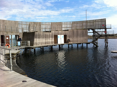
Copenhagen's Kastrup Sea Baths, designed by White Arkitektur AB and built in 2004, are a delighful invitation to take a dip. And we needed enticement the day we visited in August, during a month in which the Danes had been complaining about their cooler-than-usual summer. There was one other couple at the baths, but they'd already been in the water. The lifeguard on duty was bundled up in a fleece jacket and scarf. It was only 16 degrees, but we had to go in, as we'd come all the way from New Zealand.


Besides, the baths themselves are fantastic - in reality they are not baths so much as a circular, sheltered platform at the end of a wharf that extends from the beach. (It's a short ride - about 15 minutes - on Copenhagen's new subway from the central city to a stop that's a few minutes' walk from the beach). The structure contains changing rooms and culminates in a diving platform.


The great advantage of the circular timber structure is that there is always somewhere to shelter from the breeze. 


From the top of the diving platform, the view north towards central Copenhagen also takes in some of the offshore wind turbines. The images below show some of the other points from which swimmers can dive off the structure.


The clear panel you can see in the image below contains outdoor showers where swimmers can rinse off with a view of the Oresund Bridge leading from Denmark to Sweden as well as Santiago Calatrava's 'Turning Torso' residential tower in Malmo across the water.


In the photographs below you can see white doors which lead to the small changing rooms. That's the lifeguard reading in her chair - the cool temperatures meant it wasn't a busy day at the baths, but we were still pleased we took the plunge.


Travel: London's Serpentine Pavilion


6 comments
If you're lucky enough to be travelling to London before October 16 (or if you're living there), we highly recommend you visit this year's Serpentine Gallery Pavilion, by the Swiss architect Peter Zumthor.

From the outside, as you can see in the image below, it's an inscrutable black timber box. We haven't been able to work out what the timber is coated in, but it had a thick, hand-applied quality that lent an artisanal feel to the structure's exterior. 


There are three door-sized holes in the pavilion's exterior. Visitors can pass through any of them (entry is free). You then arrive in a dark, narrow corridor leading to other openings.


Once you've passed through these secondary doorways, you'll find the small miracle of a courtyard garden with planting designed by Piet Oudolf, the Dutchman who also had a hand in the planting on New York's High Line (along with a lifetime of fascinating projects (which you can read about here).


Zumthor's black walls throw Oudolf's pretty planting into sharp relief. It's a deeply contemplative space, surrounded by benches and tables and chairs with a view of the garden and the slice of sky above. On the way there, we'd wondered about the wisdom of Zumthor designing a garden space in the middle of Kensington Gardens, the enormous green space where the pavilion is located. But the courtyard garden works beautifully as a contrast to the open spaces outside, enhancing the appreciation of nature by confining it to this small space.


The modest but magnificent simplicity of Zumthor's pavilion is apparently typical of his work (we haven't had the good fortune yet of seeing any other structures by him, but many of you will know of the Thermal Baths at Vals, which you can see more of at the link here). His structures are rich in texture and materiality, but also inherently modest in their approach.


Each year the Serpentine Gallery commissions an architect who has not previously had a project built in the UK to design a summer pavilion in its grounds (the pavilions are auctioned off at the end of each season). Zumthor's pavilion is an interesting, self-assured contrast to the architectural fireworks of some of the projects of previous years. You can see a slideshow of previous Serpentine Gallery Pavilions on The Guardian's website at the link here.

Travel: Fallingwater


0 comments
On my recent trip to the US I took the three-and-a-half hour drive from Washington, DC to rural Pennsylvania to visit Frank Lloyd Wright's Fallingwater. It's a wonderful house and a surprisingly moving work of architecture (actually, until a recent refurbishment, it was literally moving, as the cantilever was threatening to tip into the water ... our guide told us that Wright miscalculated the amount of steel required in the concrete, and even though the engineer added more during construction, it still wasn't enough to ensure its long-term stability). Anyway, here's the classic view of the house from a short way down the river.


We approached the house down a path from the visitor centre up the hill. The view below is one of the first we saw, as we crossed a bridge towards the home's entry. The stairs in the photo descend from the living room to the stream. The wall at lower right is the edge of a swimming pool positioned in the stream, requested by Mrs. Kaufman.


The photo below shows our group at the home's entrance. The tour I'd chosen took us to every room in the house, and we were also allowed to take photographs inside. You can see in this image how the home's structure reaches back into the rock face behind it for extra stability.


Here's the kitchen, used not by the Kaufmanns, but by their cook, who accompanied them on the family's visits to the house. It's a pretty simple affair, with great views towards the stream and also across the main terrace off the living area.


The living area had to be dismantled for the home's recent refurbishment, when extra reinforcement was added to the floor to stabilise the cantilever, but now it looks much as it did when the Kaufmanns occupied the house, with a stone floor, built-in furniture designed by Frank Lloyd Wright, and a low ceiling that enhances the sense of drama and spaciousness when you walk out onto the terrace.


This view of the living area and the fireplace shows the way Frank Lloyd Wright accommodated natural rock formations in the design of the house. The red vessel is a large kettle that swings into position over the fireplace and was used to heat water or mulled wine.


The image below shows the dining area, still part of the large living space. The door at left leads to the kitchen.


This view is from the terrace off the living room, looking back at the dramatic interplay of the strong vertical chimney and the horizontal lines of the terraces. What you don't get in this image is the noise of the water rushing down the falls below, a constant reminder of the way the home hovers over the stream.


And this view is off the stairway leading up from the middle terrace to Edgar Kaufmann Jr's 'apartment' at the top of the house. Edgar Kaufmann Jr had studied under Wright at Taliesin and was instrumental in persuading his parents to hire Wright to design their weekend home. He also gifted the house to the Pennsylvania Conservancy, the reason Fallingwater is now open to the public today.


There's more to come next week - I'll post more images of the main house, and also the guest house further up the hill. But if you're heading to the East Coast of the US and are keen on seeing Fallingwater, you can book your tour at the link here.

Travel: The Glass House


0 comments
Last Sunday, I was in the US and went to visit Philip Johnson's Glass House near New Canaan, Connecticut. Many of you will already know about it: designed from 1945-48 and completed in 1949, it is credited with ushering the International Style into American domestic architecture. 

Johnson's estate, which includes a number of fascinating ancillary structures (more of which below), was opened to the public a few years ago in accordance with Johnson's wishes after his death in 2005. It's easy to get there by train from New York's Grand Central Station (the journey takes about an hour and a half), but bookings are essential (you can make them by visiting http://www.philipjohnsonglasshouse.org/. All visitors are required to check in at the visitor centre in New Canaan before being escorted out to the estate in mini-vans. It isn't worth attempting a guerilla visit, as the gate to the estate is locked through the day, and you can't see the house from the road).

Anyway, it was a beautiful summer day and the house was at its ethereal best - larger than expected, amazingly tranquil, and incredibly well-sited on a promontory overlooking the fields beyond. Everyone on our tour wanted to move in right away.


I was part of a small group of about eight people guided around the house and its grounds. The arrival at the house is beautifully staged - it's invisible from the road, and comes into view as you reach the bottom of the driveway.

You can see in the image below that parts of the steel are in need of a coat of paint. Inside, the ceiling is showing evidence of dampness. The house is in the care of the National Trust for Historic Preservation which, given the current economic climate in the US, is looking more and more to private donations to maintain the property. This is not to say the house is falling into disrepair - far from it, it's just that the Trust is having to prioritise a schedule of works at the property. Proceeds from tours assist with these activities.


This view below is from the home's lawn on the promontory, looking back into the living area. Johnson had the trees regularly trimmed to enhance the view.


This view looks through the living area, featuring furniture by Mies van der Rohe, including a daybed specially designed for Johnson which subsequently went into production around the world. (Mies' glass house, known as the Farnsworth House, is located near Plano, Illinois, and was completed in 1951.)


The sleeping area is concealed behind a wall of cabinetry, although our guide told us that Johnson (who weekended at the house in all seasons from its completion to his death) often slept in the adjacent brick pavilion just across the lawn from the Glass House, a building that was conceived as part of the original composition.


Here's the brick house, which admits light through round windows on its other side. We didn't get to see inside it because it was recently flooded; the Trust is now working on a full refurbishment of its interior. The Glass House is reached via the path at left in this picture. The circular swimming pool is in the distance.   


Elsewhere on the property, the subterranean painting gallery opens into an amazing space which, when I visited, was featuring works by Johnson's friend Frank Stella on its moveable panels.


Life on the estate sounded pretty fabulous. Johnson spent most of his time there with his partner, curator and editor David Whitney, who he met in 1960. The duo didn't throw huge parties, but regular visitors to the house were a who's who of New York society of the time. At the visitor centre in New Canaan, there's a great piece of film footage of Johnson's Rolodex, in which every name is famous, including many Rockefellers as well as luminaries such as IM Pei and Frank Gehry, Andy Warhol and Robert Rauschenberg. (Our guide couldn't tell us if Johnson had a separate Rolodex for regular people, or if he just didn't know any).  

Just down the path from the painting gallery is the Sculpture Gallery, a white brick building with a glass roof and amazing light. The sculpture at left in the bottom image is also by Frank Stella.


There are other buildings on the property, including Johnson's studio and a small building at the entrance to the estate which was the last structure he designed. You can see shots of all of them on the official website of the house. If you're in New York, do book ahead and go and see this (the visiting season runs from May through to November - on October 20 New York architect Charles Renfro, our international judge in our Home of the Year award 2010, is leading his own tour of the house - tickets for this are also on the Glass House website). It's a magical architectural experience, and an insight into what seemed to be a pretty magical and enthusiastically lived life.

Chinese Art & Architecture


0 comments
Steven Holl's 'Linked Hybrid' building in Beijing (below) is just one of the many attractions on the China Contemporary Art & Architecture tour in September, which takes in architectural and cultural attractions in Beijing, Shanghai and Xizhou. The tour is guided by two New Zealanders (who are also Beijing residents), John O'Loghlen and Sophia McKinnon, who have run similar and very successful tours like it in the past.


China can be a tough place to tour if you don't speak Mandarin, so this is a great way to see the country through its architecture and contemporary art. You'll also get access to many locations you wouldn't otherwise get to see. The tour lasts a week and numbers are limited to a total of 16. If you're interested in taking part or getting more information, you can email John on john@gunghoventures.com or Sophia at sophia.mckinnon@googlemail.com.
older post

Recent Post