Showing posts with label outtakes. Show all posts

New Home Design


0 comments
Our new cover is on newsstands today - the beautifully crafted home on it is by Michael O'Sullivan, the photograph is by Emily Andrews, and the shot was styled by Yvette Jay. 

 Inside the issue is an abundance of great stuff, including homes by Wellington's Tennent + Brown Architects, Atelierworkshop, Christchurch's Wilson & Hill and Auckland's Andrew Patterson, as well as our former art director Miranda Dempster's New York apartment and a beautiful cabin built by expat New Zealander Adrian van Schie in New York State's Adirondacks Mountains. 

Also! We present our biannual bathroom design focus, travel to six chic global destinations, design writer Douglas Lloyd Jenkins tells a tale of the rebirth of a sleek mid-century hotel in Putaruru, we feature Kate Sylvester and Douglas + Bec's new furniture range, and much more.

Outtakes: The Onemana Bach by SGA Architects and Unitec students


0 comments
Our current issue features a short Q+A with architect Dave Strachan of SGA Architects, talking to him about his work with students at Unitec to design and build social housing in collaboration with Auckland's VisionWest.
This isn't the first time Dave and his students have worked together to build something remarkable - last year he and his team designed and built a thrifty bach at Onemana Beach on the Coromandel Peninsula that was a finalist in our 2012 Home of the Year award. (These photographs are by Simon Devitt).


Dave and his students at Auckland’s Unitec School of Architecture were assisted on this project by architect Marshall Cook and builder John Cocks. As a result, all of these students can claim they will leave university with real-world architectural experience: as well as collaborating on the design of the bach, they built it at the Unitec campus before it was trucked to its site on the Coromandel Peninsula.

This is a good point at which to add contdxt to Dave’s remark in our original article accompanying the Home of the Year issue. In it, we quoted Dave as making an unflattering remark about architects in general, but what he was really trying to say was that there is a perception that architects are regarded this way, and that the way students work with tradespeople in this exercise helps to close the gap between architects and the professionals they collaborate with. Our apologies to Dave for allowing this remark to run in the magazine in a way that made it seem like he was slagging off his own profession, when in reality he holds architects and architecture in the highest esteem. 

 
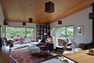
Above: Andrew Morrison relaxes on the deck in a cane-swing chair while Shiree and their daughters Rubie and Billie hang 
out in the kitchen. Morgan Cronin from Cronin Kitchens advised the students on building the cabinetry.


Above: The living room opens out to decks on both sides. Former Unitec student 
Tim Webber designed the table to match the Morrisons' Ikea chairs.
Part of Dave’s mission in leading this project at Unitec is to encourage productive working relationships and good communication between these students when they graduate and the tradespeople they will work with on future architectural projects. Building the bach was a vital part of this process. The students, Dave says, might say, “oh, we just want a nice flat floor to go through there – well that’s wonderful, but how the hell do you do that, to document it and then build it? That makes it a useful part of architectural education”.

Dave was a builder before he became an architect and has the deepest of respect for both professions, as well as a keen awareness of how poor detailing and communication can compromise a project. “Design is what [students] are taught to do,” Dave says. “It’s what most schools of architecture focus on. But a lot of design decisions are made during documentation – everyone thinks it’s the boring bit, but really it’s very much about trying to keep the integrity of the design idea you had at the start.”


Above: The ultimate in indoor/outdoor flow: a floor that continues almost seamlessly from the kitchen out to the deck. 
The deck chairs, covered by Shiree, are from Nest.

Above: A view of the dining area opening onto the second deck. In the background, the barbecue from 
The BBQ Factory echoes the strobe-like effect from the slatted roof.


Above: The barbecue deck is also the perfect place to relax in front of a little fire and watch the starry sky after sunset.


Above: Billie and Rubie playing in the living area with the windows panels drawn back to enjoy the sun. 
Below: Dave and some of the members of Studio 19, his student design team.


Outtakes: William Tozer's London loft


1 comments
Here are a few unpublished outtakes from a home featured in our current issue, a loft apartment in a former factory in London designed by New Zealand-born architect William Tozer. Photographs are by Emily Andrews.

Seen below, shelving in the TV room - a snug space off a generous, gallery-like hall - displays a collection of artworks and books.


A study area is also located off the gallery space, with a built-in desk and shelving. 

 
The dining area (below) features pendant lights by Phillippe Starck, a table by Belgian designer and architect Maarten van Severen and 'Pelle' chairs by Hiroyuki Toyoda.


There's a view of the London skyline from the terrace, which wraps itself around two sides of the apartment. 


Tozer's design preserves much of the building's industrial origins, leaving the raw concrete ceiling exposed throughout the building. In the kitchen, pipes for the rangehood are also left exposed. 


The view below looks from the kitchen towards the apartment's living area. The pendant lights over the kitchen island are by Danish designer Cecilie Manz.


This shot of the home's main bedroom shows William Tozer's clever insertion of new elements such as the en suite bathroom, with the dark timber clearly demarcating the old and new structures.


Outtakes: Pahoia house by Warren and Mahoney


0 comments
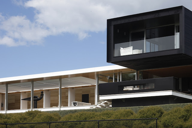
Our April/May issue Home of the Year issue featured this finalist in the award, a magnificent home near Tauranga designed by Andrew Barclay and Richard McGowan of Warren & Mahoney.The home is a linear ground-floor arrangement of bedrooms and living areas, with a black main bedroom suite and study on the black upper floor, which is placed transversely to the main volume of the house. In the shot below (all the photographs are by Patrick Reynolds), you can see the house on its beautiful peninsula site.


The home's owners asked Andrew and Richard for a home with sculptural lines, a sense of restfulness, and a focus on quality and permanence. The house was to be "simple and strong and bold" for a life of "reading, privacy and quietness." The two shots below show more clearly the relationship of the upper and lower volumes of the home, with the upper floor projecting over and providing shade for a lower-level terrace.


All the home's main spaces face north, including the outdoor room (shown below), which features a reflecting pool with a large sculpture by Paul Dibble. It's the beautiful outcome of the owners' desire to emulate the European concept of entering a courtyard before moving into the house proper. It's also a way of encouraging sheltered outdoor living by dissolving the barriers between indoors and out. Visitors pass under the bridge-like form of the home's upper floor before walking through the front door, which opens directly into the outdoor room.


The outdoor room is anchored, like the rest of the house, by a wall of travertine that acts as the building's spine (below).


The view below looks back from the outdoor room to the home's main entrance, featuring another sculpture by Paul Dibble across the driveway. 


The owners wanted the home to feel equally comfortable when their six children were around or when just the two of them were home. The main living area, entered from the outdoor room, is an intimate open-plan sequence of sunny sitting area, a kitchen and dining space and a compact formal sitting room with a fireplace.


When the (mostly adult) children are visiting, they have the home's west wing, with three bedrooms and a small living room. At the eastern end of the ground floor is a separate guest suite featuring this elegant ensuite bathroom.


Upstairs, a dark-painted library located behind the main bedroom makes for a comfortable winter evening retreat.


The view below is from the guest suite on the ground floor, a lovely perspective looking north over the estuary. Thanks again to our Home of the Year partner, Altherm Window Systems, for working with us to present these fantastic homes.


Outtakes: Home of the Year 2012


0 comments
Every magazine shoot yields far more images than we can ever fit in our pages - so we like to take the opportunity to show you a few of our favourite outtakes here on the blog. This time, it's our Home of the Year 2012 by Herbst Architects, that marvellous structure amid a pohutukawa grove at Piha. The photographs are by Patrick Reynolds - and once again, a big thank you to our Home of the Year partners Altherm Window Systems for their support of the award. Thanks also to our intern, Jett Nichol, who's here for a week from Napier learning a bit about the magazine trade (as well as compiling these albums).

The image below shows the steps from the house out to the back deck, which catches the morning sun in summer. This opening also establishes a strong diagonal connection across the living space, as well as allowing cooling cross-breezes in summer.


In each bedroom, the walls have been lined in poplar ply, its light colour establishing a calm mood. This shot shows the main bedroom, which is entered via a mezzanine walkway above the living space.


The branch-like roof struts reinforce the relationship between the man-made structure and its natural surroundings, blurring the boundaries between the building and the tree canopy.


Inside, the tall timber wall (its cedar patterns mimicking the pattern of the bark outside) makes the living area undeniably cosy, despite the openness of space.


This view of the home shows the boardwalk drive platform leading to the carefully concealed single garage (which is under the main bedroom). The house was designed on piles positioned to avoid the pohutukawa roots on the site.


Outtakes: Bergendy Cooke and Guy Fisher's Arrowtown house


0 comments
We've been receiving plenty of good feedback about our current issue, much of it fan mail for the house near Arrowtown designed by Bergendy Cooke (of BCA Studio) for her partner Guy Fisher and their daughters Anouk and Kiki. This was more than enough encouragement to feature some outtakes here from Paul McCredie's shoot at the house.

This image shows the house on its site, rising abruptly (and intriguingly) from the lawn. The doors downstairs lead to the living areas (set back to provide summer shade), while upper-floor windows are tinted and set flush with the exterior. The slats you can see on the upper floor are part of a deck containing a sauna and open-air bath.


The home's northerly elevation has a subtle kink in it that provides for a slightly different aspect from each of the rooms in the living area and upstairs.


Inside, the living areas are semi-open-plan, with walls of black cabinetry dividing the living and dining areas.


This view below looks back towards the kitchen through the dining room. 


Let's go upstairs now - up the stairwell lined in beautiful boards of Southern Beech, to be exact (they're oiled with a product that has a whitening agent in it, so the boards now look as if they have soft pink tones).


Anouk and Kiki share a room. Bergendy and Guy designed some cool bunks for it.


The image below shows the steps (that double as shelving) from the guest room to the upper deck with the sauna.


And here's another view of the home's exterior, showing the entry at right (a door to the living room is at left).

Outtakes - Adam and Gaby Ellis' Wellington house


0 comments
Our new issue is only just out, yet a number of people have already nominated Adam and Gaby Ellis' Wellington house, designed by Amelia Minty, as their favourite. (Like exemplary parents, we don't pick favourites as we love all the houses we publish in our pages equally). 

In any case, these early expressions of enthusiasm seemed like a good reason to publish some of Paul McCredie's lovely images that we couldn't squeeze into the magazine. Here are Gaby and Noa in the living area, with its great green views to the bush of the neighbouring hills in Houghton Bay:


Another view in the living area - this window offers a view south, with a peek at the sea. But mostly, the house is cleverly tucked onto its site with a hill to the south that shelters it from southerly winds.


You enter the home on the lower level, then climb the stairs in the photo below to reach the kitchen, dining and living space: 


This shot looks back down the stairs (at left) towards the entrance.


Outside, the house is remarkable for the way it connects with its verdant surrounds, partly thanks to Adam's landscaping expertise (he runs the Wellington landscape design firm Pollen, which has just outfitted Nikau Gallery Cafe with some swish new courtyard furniture).


Another key contributor to the home's success is the way cars are parked outside, requiring a short walk up to the house. Not so handy on a rainy day, but we think the approach to the house (designed by Adam and shown in the three images below) is so appealing that facing a bit of bad weather is a small price to pay: 


The image below shows the view looking down past the master bedroom and its deck to the deck outside the main living area, covered with a pergola.


This view of the house shows how Amelia designed it to step down the slope - a refreshing change to boring, bulldozed-flat sites, and one that makes the house much livelier as a result.


older post

Recent Post